When we first moved into No.80 in late 2014, potential was pretty much all it had.
A handsome early Victorian semi in our favourite area, it had lovely bones but had suffered a series of alterations done on the cheap to turn it into three bedsit flats. Although it certainly wasn’t a dream home to begin with, we realised that we could turn it into one. What we didn’t realise is just how much time, effort and money it takes to get there.
Like most first-time home renovators, we imagined that with a little work we could turn an unloved house back into a family home without many problems. The reality has been lengthy delays trying to secure planning permission, unexpected costly issues popping up taking us over budget and something that no-one could have foreseen - building work grinding to a complete halt with the onset of the UK coronavirus lockdown.
At times, we have felt very frustrated and far away from where we wanted to be. It’s been a longer, harder, more expensive process than we imagined. There’s still a bit of a way to go until everything is perfect, but we’ve been able to order the furniture to take it closer to our ideal space - which feels like a milestone moment.
In a way, being restricted to the house has made us even more focused on getting it right. You can read about the process of designing our open-plan kitchen and family room in more detail, as well as our new master suite, and how we designed our dream kitchen with Howdens.
We are still waiting on worktop installation, which has been cancelled several times now, some plumbing work, final fix electrics and some elements of the kitchen being finished, although those are now scheduled to resume this week.
It's definitely first world problems, I completely understand that, but being stuck with a half-finished kitchen for months has been difficult. There isn't an end in sight, like so much in life right now. But going ahead and ordering the furniture has helped us to feel like progress is being made.
The Basics
First things first, the flooring, walls and construction of the space all play their part when it comes to determining the final design.
The site we’ve extended into is quite awkward. As our house is situated on a bend in the road, the garden doesn’t run straight back from the house, but goes on a diagonal away from it. The property also backs onto a canal, and there is a steep level change from the front of the house to the back.
These elements presented quite a few design challenges, but with the help of our builders, we were able to turn them into positives. What we’ve ended up with is a really quirky design full of interesting angles.
You come into the space with an enclosed utility room and small downstairs toilet on one side, and two floor-to-ceiling larder cabinets on the other. In the kitchen proper, there is a run of units and appliances down one side, and a central island that houses a dishwasher and undermounted sink, as well as providing seating.
There’s then a step down into the ‘family room’ - a space for informal dining and play. This part of the room has a wall of bifold doors leading straight out into the garden and features a gabled glass apex.
We are so lucky to have this new space in addition to our existing living room and dining room, and to have been able to build it without losing any of the garden. To the rear of the house was previously an ugly old pebble-dashed garage that we got rid of. You can take a peek at what the space used to look like before building work began here.
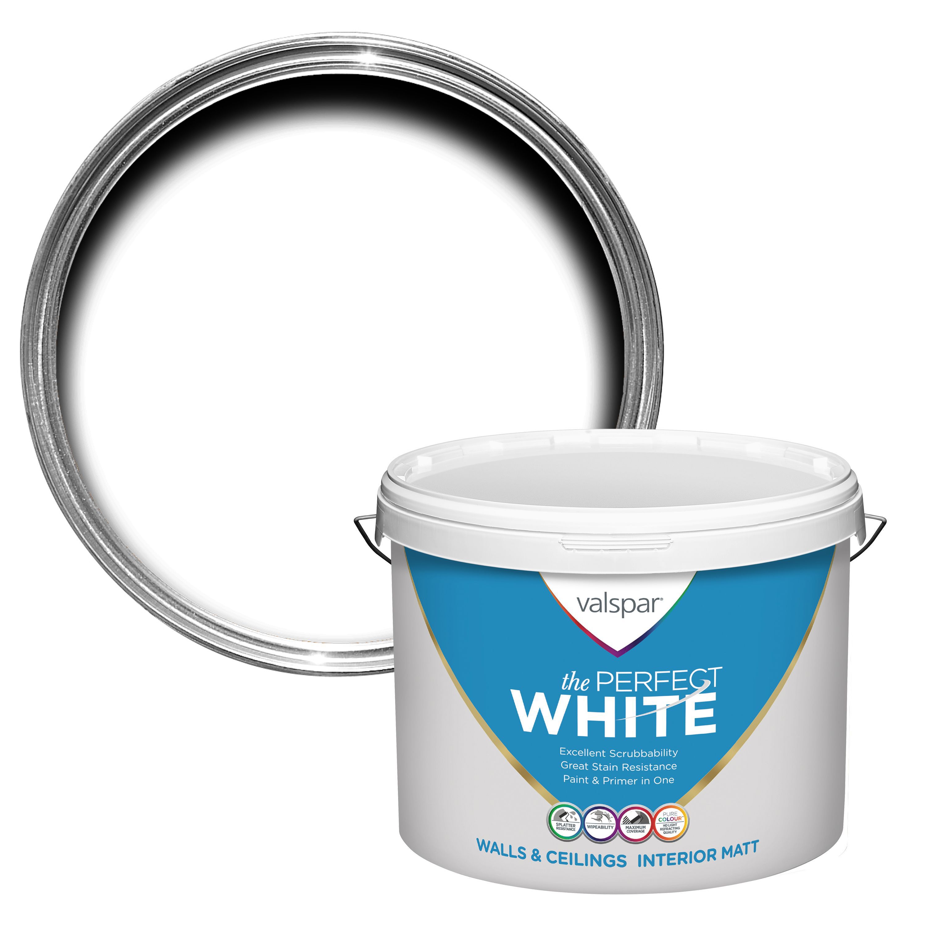
When you take on a renovation, there are necessarily some areas where you need to compromise to save money, and for us, one of the easiest ways to do that turned out to be the flooring.
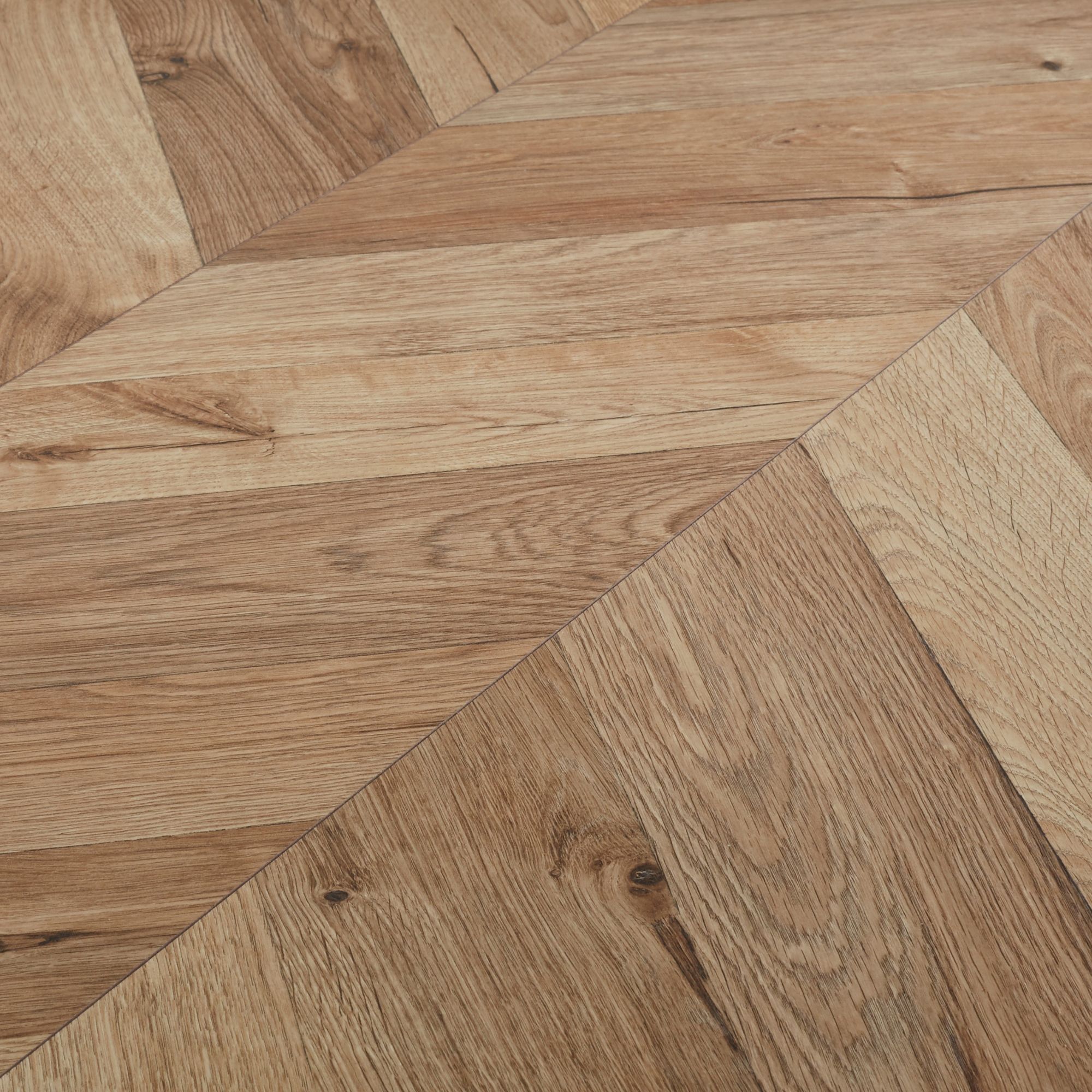
Initially, we had dreamed of hardwood floors but because we decided to go for underfloor heating, it was ruled out (underfloor heating cannot be used under solid wood floors). And so it became a good area to make a saving. In the end, the pretty chevron design of the GoodHome Heanor Natural Oak Laminate won the day, as it's hard wearing and practical for a space that will have kids running in and out of the garden.
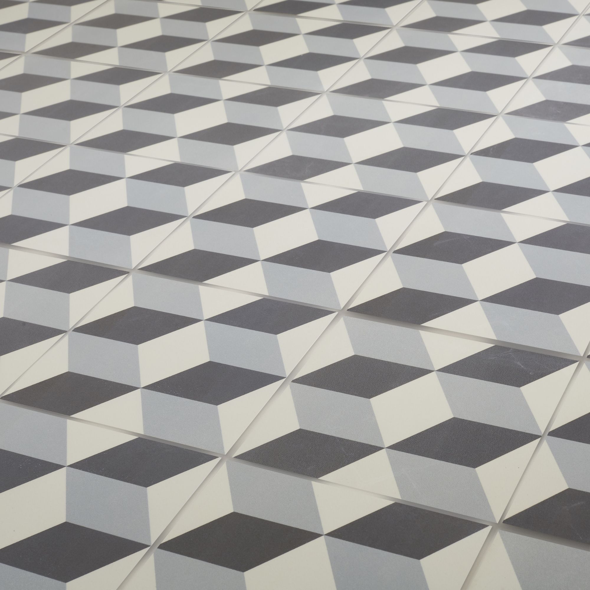
In the utility room and downstairs toilet, we switched it up using these Hydrolic Matte Concrete Porcelain tiles - both sourced for a great price from B&Q.


The kitchen was designed by Howdens using their Lewes modern shaker style units in Slate Grey, with slim brass handles, and we paired this with solid white quartz worktops from Granite Earth (although they have yet to make an appearance) and a Rangemaster Nexus SE cooker and Hi-Lite Slim cooker hood in Slate, supplied by Appliance City. The rest of the appliances are all integrated into the cupboards for a more seamless look.
With these basics in place, we could begin to understand what furniture would suit the remaining space.
The Furniture
It's lucky that the Mr and I have pretty similar tastes in most things, and we’ve never really disagreed on how to furnish our homes. We both respect great design, and we like quality pieces that are built to last, mixing new things alongside antique and upcycled pieces.
The style we wanted to achieve in the new space was a balance of traditional and more modern industrial style, to respect the period that the original house was built in. It had to be child-friendly and fairly practical but we also wanted it to look design-led. And because the whole project has cost dearly, we wanted to have a finish that we can love for years to come.
It all started with the sofa. We had a very clear vision for the sofa we wanted, but it took a fair amount of research to find it. In our main living room, we have two Chesterfield style sofas, but as the family room is a more informal space, we felt a corner sofa would be ideal. I was dreaming of family movie nights all snuggled up together!
We wanted to find a design that had a little more of that traditional, buttoned styling to it with a low back for a modern twist. It also had to have a matching ottoman available, as we wanted to use one instead of a coffee table. They are useful for storage as well - the kids are going to have toys in here but we wanted to be able to quickly tidy them away. Oh, and we were also set on a dark, dramatic colour.

Made.com have always been a favourite of mine for this style of design. When we saw the Made ‘Scott’ 4-seater chaise corner sofa in an inky navy blue velvet, it was perfect.

We brightened it up with some amazing printed cushions from Italian design house Fornasetti (available at Amara) whose playful designs with historical references I love.


While I was there, I also spotted the Made ‘Leto’ marble and brass floor lamp, which captured me with it's beautiful, timeless design - and very handy built-in shelf. I also bought the Asbury flat weave runner rug for the hallway at the same time.

One piece I had coveted for a very long time was the ‘Ziggy’ sideboard from Swoon Editions. It’s such a statement piece, full of glamour and a hint of rock n roll. It comes in Silver, Copper or Brass finishes, and the last was perfect for us to pick up on the brass details we’d chosen for the lights. It gives a little more storage for toys and family clutter as well.
The dining table was a little bit harder to choose. We wanted something with an extendable design to give flexibility, as we’re planning to use the space when friends and family come round to entertain.

Dining chairs were another thing we found it harder to choose. Material was the sticking point - I didn’t want wooden ones, again because of the floor, and I didn’t want more velvet because of the sofa.

Around the kitchen island, we have chosen Kartell ‘One More Stool’ Bar stools, ordered from Amara, which have an elegant, traditional design worked in ultra-modern clear perspex. Of course, they do dining chairs in this style too, which I thought about but decided would be too ‘matchy’. We were sort of stuck for a while.
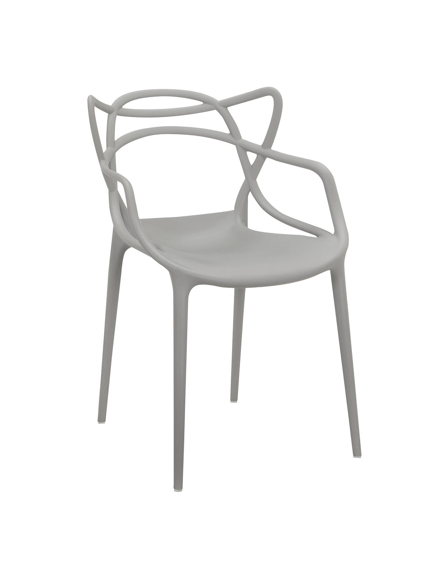
The answer came in the form of the Phillipe Starck for Kartell ‘Masters’ chair, ordered from John Lewis, an elegant, woven back design that we chose in a light grey. I love the open, airy look which allows light to flow around the space, and the almost organic form that echoes the tree branches in the garden beyond. I also like the fact they are made from polypropylene and completely wipe-clean - immensely practical with two under fives in the house.

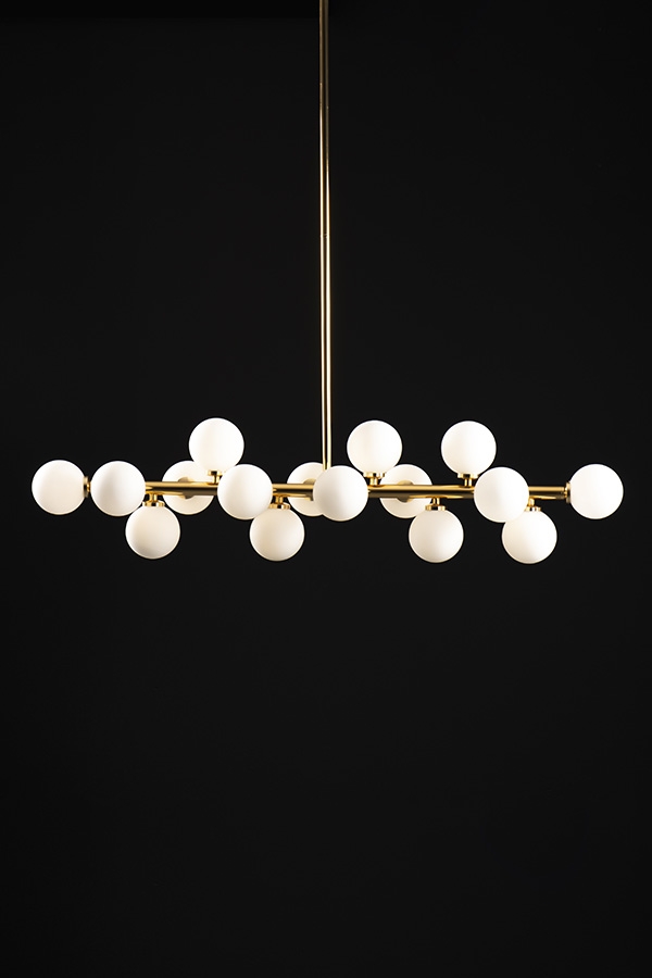
The final touches with furnishings were to add a couple of statement light fittings. These we decided had to be brass to pick up on the brass handles on the kitchen units. We chose the ‘Ashwin’ brass sputnik light from Laura Ashley for the living room (snapped up just before they very sadly went into administration, which is a huge shame) and the ‘Morantz’ brass and frosted glass bubble light from MyFurniture to go over the kitchen island.

We also chose to add this Hartley’s grey and bamboo ladder storage unit to make our ‘coffee bar’ with all our different beans and syrups and some of our alcohol as well. This is such a nice way to make a little feature of an unused corner.
One thing we still need to source is art for the walls. As there are no windows to the side walls, we have space for a huge canvas. I would like to commission a local artist to create this, but that’s a process which takes time.
In the meantime, we have our gallery wall of prints to make up (made easy to do using this kit) and I want to order a couple of prints from Mint & May and Desenio to add a bit of interest, along with the autographed menus from Sat Bains that we’ve kept for years and always meant to frame in the new kitchen.
I’m sure we will continue to add little accessories and tweak elements - family space is always evolving - but I’m so happy with where we are for now, and despite the problems and delays with getting the building work finished we are just focusing on how thankful and appreciative we will be when we have the finished space at last.
Are you stuck with half-finished building work? What furniture have you been buying lately?


I admire this article for the well-researched content and excellent wording. I got so involved in this material that I couldn’t stop reading. I am impressed with your work and skill. Thank you so much. engineered wood flooring UK
ReplyDeleteThe extension workers, therefore, not only informs farmers to improve their lands and prepare a cropping pattern, but also motivate them to use improved agricultural implements and adopt the modern agricultural practices according to their socio- economic status.Refurbishments Didsbury
ReplyDelete