The Mr and I are both keen home cooks, and yet we’d never had a decent space to play chef in. When we bought our first home, the kitchen was just okay-ish enough that we never got around to tackling it before we needed to move.
When we bought No.80, we knew we wanted to install our dream kitchen - but there was no point doing it before we could afford to build an extension.
The house had previously been subdivided into three student bedsit flats, so the kitchen wasn't the best quality.
Life (and having kids) gets in the way of the best laid plans though. By the end of last year, we’d spent five years living with chipped worktops, badly designed cabinetry, scuffed lino floors and an oven that only worked sporadically. It was definitely time for a change.
Our Inspiration For A New Kitchen
Cramped layout? It’s just full of character. Tired units? They’ll be fine with a lick of paint. £5K budget to completely redo everything? Of course you can.
Like most good dreams, it started on Pinterest. I contentedly curated a board full of my usual suspects - elegant Parisian apartments, chic London townhouses (who doesn’t like a bit of luxury home porn?) - and it was really useful for gathering inspiration. Meshing those ideas with your actual situation and budget is really the hard part.
Luckily, the Mr and I have pretty similar ideas about how we want our home to look. We chose this house because we both love the history and the architecture, so the kitchen design had to nod to that - no ultra-modern glossy units and sleek chrome fittings for us.
But at the same time, we also wanted to add a contemporary twist (the Mr has handily coined this approach ‘meritage’ - modern heritage - get it? He thinks he’s a genius. Mind you if that pops up in Farrow and Ball’s marketing anytime soon, you heard it here first!).
The space also had to be very family-friendly. We have two children under 5, and as every parent will know, they are little sticky tornadoes and certainly no respecters of expensive interior finishes.
As we are lucky to already have a separate living room and dining room, we wanted this new space at the back of the house to feel more informal - somewhere we could play with the kids and enjoy time as a family.
At the same time, we wanted something stylish as well, so that we can entertain our friends and relax once the kids are in bed. This meant the space had to be carefully designed and very hard-working.
Working With Builders And Architects
With our visions of an open-plan, ‘meritage’ style kitchen in mind, it was time to take the plunge and extend. We knew that we would be able to make space for the extension without losing much of our garden by knocking down an old, pebble-dashed freestanding garage that stood behind the house.
Both our home and the house next door have been extended slightly to the side in the past, so you couldn’t get a car down the driveway to it - it was purely used for storage. It was also extremely ugly, and blocked the view of the garden from the house. Its days were numbered.
We had heard that people out there actually want to buy these hideous prefab garages. So skeptically, I listed it on eBay. To my huge surprise, it got a lot of interest, and eventually sold for a few hundred pounds. More importantly though, the buyer came and dismantled it and took it away, which saved us a huge headache.
In the meantime, our next door neighbours had approached us about doing a joint build, as they were also adding a downstairs extension. This approach meant we could save a small amount on equipment costs and get a harmonious design where the space ran right up to the party wall.
Getting planning permission was a lot harder than we imagined - the designs were rejected a few times before it passed, and it ended up taking six months to get permission to build. The site had its challenges - technical things that we didn’t consider when we bought the house.
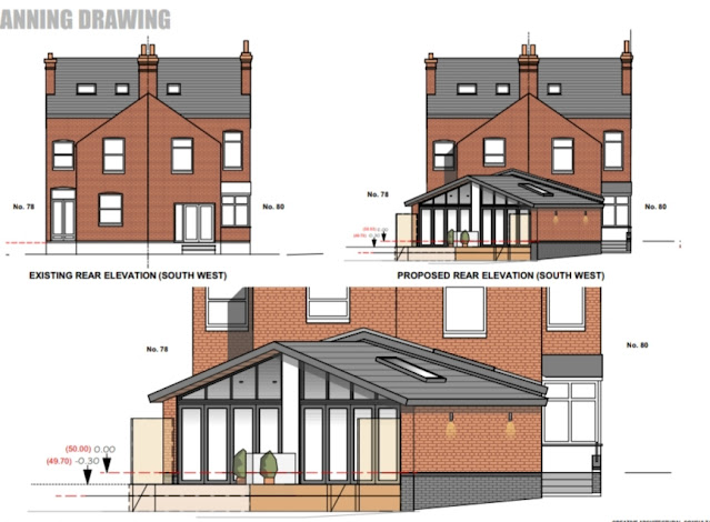
Below are the architects drawings showing the design and floorplan of the new extension. The dashed red line halfway down was where the old kitchen ran to, showing where the previous patio doors opened - beyond that would all be part of the new building.
In the end, our architect had to design a very unique, double-height gabled roof, and an angled building to meet the demands of planning and the site itself.
However, this has given us so much more than just a square box stuck on the back, and we’ve ended up loving the quirky angles. We wanted to make the kitchen/family room the heart of the home and find a way to create a bit of that fabled ‘wow factor’ the building was lacking.
The space has a step down from the kitchen into the family room area to overcome the level change between the front of the house and the garden, but that creates quite a nice feel. The room ends in a big wall of bi-fold doors which open out onto the garden, and a glazed apex that lets in lots of light.
The Search For A Kitchen Designer
The next step was trying to make our vision for what we wanted come to life - and not cost the earth. This is, of course is, the deeply tricky part. And just like the old adage about having to kiss a lot of frogs to find your prince, we visited quite a few kitchen suppliers before meeting our match.

First up, Wren. I had actually heard a few horror stories about them from a friend of mine (not really to do with Wren themselves, but more the awful subcontracted fitters they used and then refused to take responsibility for). As our building contractor was going to be installing the kitchen himself, it didn’t overly put me off.
Wren’s approach was to start by asking what cabinet doors we wanted - before even looking at the layout. Surprise, surprise, the ones we chose were the most expensive, hand-painted ones - that colour was not available in any cheaper alternatives. Their approach was very sales-led. They sit you down, give you the VIP treatment and a swag bag full of branded goodies, which you’re definitely paying for in the final price.
Their kitchens did seem nice quality, and I did love the time and attention they took with us, but of course, that is all part of the process in trying to convince you that £25k is a reasonable amount to spend on a kitchen.
This was so laughably over our budget of £12.5k that it knocked us back a little bit - clearly we needed to adjust our ideas about what we were spending, but Wren’s cost was astronomical. We began to wonder if it was possible to achieve the quality finish we wanted without completely blowing the bank.

Our next port of call was Wickes. It's not a place many people think of immediately, but we had popped in a lot for supplies during the course of the renovation, and noticed their kitchen section.
The main thing that surprised me with Wickes was actually the quality of their units. Everything is very solidly built, better engineered than I might have assumed and backed with a 15 year guarantee.
Their approach to the design process was completely different from Wren. At first they wouldn’t give us a price whatsoever. They supply an estimate guide that gives a rough cost for units, worktops etc, and then a quote arrives once they’ve come out to your home and measured up. We found this very hard to get our heads around. How could we know if we wanted to proceed with them without understanding the cost?
Timescales also worried us. As the extension was going up around us, we didn’t want to be left waiting on a kitchen for weeks and weeks, if everything was built and we hadn’t even had them out to measure up or decided whether we could afford what we’d chosen. How many weeks would we be without a kitchen in that case? We managed to get a rough cost out of them of around £18k, which was a lot less than Wren, but still way over what we wanted to pay.

At this point we felt a bit stuck. We ended up at Frank Key, which most of you will know as a builder’s merchant. However, they also design and sell kitchens and bathrooms, mostly to trade but to members of the public as well. A family friend of ours runs the department there, and although this was good on one hand, we also felt a little awkward about going there in case we didn’t like the design or couldn’t afford the price.
We ended up going in with our architect’s plans, and having a really in-depth consultation which made us think much more about the functionality of the space - how we like to cook, what we wanted to be able to do. And this gave us lots of little ideas, such as opting for more drawers over cupboards, and using pull-out baskets in a larder unit to keep our dried goods.
The total cost came out at £12k, which was a lot more on track towards our original budget of £12.5k.
But by that time, we had seen ‘the one’ - the kitchen of our dreams - somewhere else.

That kitchen came from Howdens. Howdens are a joinery company that specialise in kitchens. They have a system of working through builders, so to get an appointment you need to have a builder who is a customer of theirs.
This affects the pricing - basically the more custom your builder brings them, the greater the discount. Pricing is never transparent because you are not given a full breakdown of costs, only a top line figure. All the detail only goes to your builder.
This was the only element we found difficult, because we were counting on using that detail to lower the price, by sourcing some elements separately ourselves - which is exactly what they want to avoid.
What was outstanding about Howdens was our designer, Charlotte. She was the first one to really reconsider the space. All the other kitchen designers we’d met simply followed the design our architect had laid out in his plans. And we never thought about challenging it either, probably showing our newbie renovator status.
Howdens immediately took it back to basics, asking about our living situation and how we wanted to use the space and then suggesting an entirely new layout that worked so much better for us.
We explained that we wanted to add on an open-plan area that gave a feeling of spaciousness - where the kids could hang out while we were cooking, or that we could use as a social space when friends came round.
In the plan the architect had sketched in, there were runs of units on either side of the wall, with the cooker and other appliances on the adjoining wall to next door. A peninsular unit with a sink ran halfway across the space, next to the step down into the family room area. On the other side of the peninsula were stools so the countertop could be used as a breakfast bar.
Howdens immediately pointed out several ways the design could be optimised:
- Appliances moved to the outer wall, which avoids having to run expensive venting across the room through the ceiling
- Removing the peninsular, as this visually cut the space in two when we wanted a feeling of openness
- Pointing out that the breakfast bar stools on the other side of the peninsular would have to be so high (due to the step down into the family room) that they wouldn’t be safe for kids
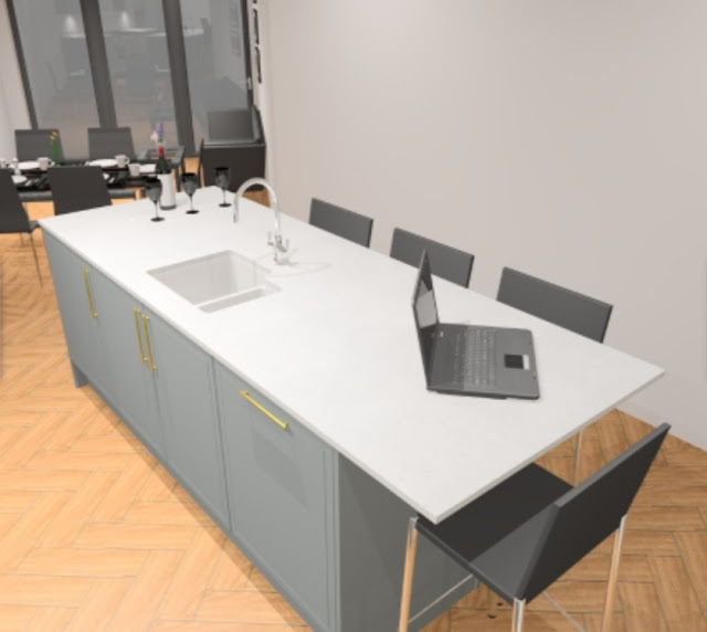
- Suggesting units on one side only and a large central island to open up the space and create a more social feel
- Creating a clear path of travel down to the bi-fold doors at the end so the kids could run in and out of the family room and garden without having to go near the oven or get under the feet of anyone cooking. This also gave a line of sight down the kitchen to the garden
- Using dead space in the large chimney breast alcove to fit two huge floor to ceiling pantry cupboards
We were so impressed that someone had thought outside of the box to create a space fit for our needs.
As first-time renovators, who have never bought a new kitchen before, you’re relying on the expertise of a kitchen designer to ask the right questions, which is exactly what Howdens did for us.
It helped that we had also completely fallen in love with one of their kitchens along the way. The Lewes design was a traditional, shaker style cabinet, but with a much slimmer border that made it seem more contemporary than others we had looked at. Paired with slim brass handles and white quartz worktops, it was exactly the effect we were hoping for.
Choosing the Howdens Lewes kitchen also settled a few design elements we’d been unsure about. We had been torn between wanting a grey kitchen and being drawn to a deep midnight blue. We loved the look of the navy, but worried it might be too trendy and carbon date the kitchen quickly.
As the Lewes kitchen only comes in white and grey, it made the choice easy, and I think it was the right one. We were able to add a navy touch in with other elements, like our new sofa. Choosing grey and brass felt a little more classic than the blue and copper we had been considering.
How We Saved Money On Our New Kitchen Design
There’s no doubt that getting what you want with a kitchen design is expensive. Our original target had been to spend no more than £12.5k on the project (excluding the cost of the extension itself). We ended up over that estimate, which was largely as a result of our own choices.
As a total amount, we have spent so much on the project and we didn’t want to compromise on the final details. That meant a bit of frantic last-minute saving and recalculation. We had to make a few decisions which were purely based on money though, and decide what areas we would compromise on and what areas we wouldn’t.
We saved money by:
- Choosing units from a cheaper range for the enclosed utility room
- Sourcing all the appliances ourselves and negotiating the price
- Going direct to a supplier to source solid quartz worktops
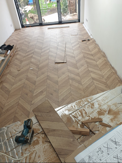
- Choosing laminate flooring rather than solid wood (this choice was made easy because we wanted to have underfloor heating, which can’t be used with solid wood anyway!)
In the end, the cost from Howdens was just over £9k. That may look like the cheapest when you consider Wren had quoted £25k, Wickes £18k and Frank Key £12k, but we had already stripped out a lot of the elements that were covered in the other quotes, so it only covered cabinets, sink, and a couple of other smaller things.
Plus, there was a £2k cost for the fitting. Most of the expense was down to our own choice though, so we overan our original £12.5k budget, but not too drastically. The total cost, not including the building of the extension itself or the flooring, came to just under £14,000.
Sourcing Kitchen Elements To Save Money
We managed to get a Russell Hobbs fridge freezer and an AEG dishwasher which we made offers on, and we kept our existing Bosch washing machine and tumble dryer as well, because they were still in great condition.
We had set our hearts on getting a Rangemaster cooker, which isn’t the cheapest option. We also wanted the Nexus SE which is one of the more expensive models, which didn’t help with the budget.
We decided it was something we didn’t want to compromise on, but we really did shop around to secure the best price we could. We bought both the Rangemaster oven and the matching slimline cooker hood from Appliance City, who negotiated a discount with us, and Rangemaster themselves were running a promotion for £250 cashback if you bought both a cooker and hood.
That brought the total cost for the range and hood down to £2.5k, which is still a lot but is good value for what we got. I’m so pleased that we didn’t compromise because I absolutely love the quality and ease of use - it's the perfect oven for someone who really loves to cook.
Worktops were another area where we had our heart set. Solid quartz isn’t the most budget friendly choice, so we knew we had to be smart about where we got it from.
We shopped around several companies, hoping to hit around £3k for the worktops and upstands, and ended up going with a company called Granite Earth at a cost of £2.5k for the quartz and the specialist fitting service.
This ended up being extremely delayed due to the Covid-19 lockdown, and we were left for about a month without worktops and no sink, just sheets of cardboard and two litre bottles of water we filled up from the bath! The day the worktops actually went in was sensational. Not only did it make the kitchen usable but they look amazing.
Sometimes I just want to sit and gently stroke them...
Now the kitchen is almost ready and just waiting for a few final touches for its big reveal.
See you there!


Your kitchen is without a doubt one of the most loved rooms in your home and is a characteristic social event place for the family.
ReplyDeletekitchen installer near me
Your blog is a wealth of information and resources. I will definitely be referring back to it in the future.
ReplyDeleteKitchen Installers Northampton
I am blown away by the creativity in this kitchen design. The use of unexpected elements, such as the painted ceiling and the floating shelves, adds so much depth and interest to the space. Well done
ReplyDeleteKitchen Designers Luton
The attention to detail in this kitchen renovation is impressive, from the elegant hardware to the intricate tile work.
ReplyDeleteKitchen planners near me
The new lighting fixtures in this kitchen design are a game-changer - they add both functionality and style to the space
ReplyDeleteKitchen Designers Luton
The arranging system proceeds, on a more limited size, as you are coming to additional conclusions pretty much the things in general and issues that make up a complete kitchen design.
ReplyDeletehttp://modernkitchen.co
"With its innovative design and advanced technology, my air purifier helps eliminate cooking odors and keeps the kitchen environment fresh and clean while I experiment with various recipes." www.modernkitchen.co
ReplyDeleteAdding a fresh layer of mulch to your garden beds can improve curb appeal.
ReplyDeletegutter fix near me
Notable corporate event planning companies in Denver offer their expertise to businesses looking to host memorable and impactful events. These professionals understand the unique characteristics of the Denver business landscape and leverage their knowledge to create tailored experiences that meet the specific needs of corporate clients. corporate event planning denver
ReplyDelete